“Creating a Digital Cultural Heritage community”: Enroll now!

By Fred Truyen and Ana Schultze

Do you want to know what happens behind the scenes of museums, archives and libraries? Have you ever wondered what these organisations do to share their collections with audiences? Would you like to learn how to build a strong digital community for cultural heritage?

If your answer is yes, then the MOOC “Creating a Digital Cultural Heritage Community” is for you! In this MOOC, professionals and volunteers in cultural heritage institutions, as well as teachers, students and amateurs, can learn how to create user engagement with digital cultural heritage. Professors and staff members from the KU Leuven master’s program in Cultural Studies will dive deeper into both theory and practice of digital curation, annotation and many other topics.

What you’ll learn

  • How to create and reflect on user engagement with online collections
  • How to curate and annotate digital cultural heritage
  • What strategies can be used to educate audiences
  • How to access and use digital repositories and platforms
  • How to creatively engage with photography and dance content.

Have you ever wondered how to use digital collections to create new ways of engaging and inspiring audiences? Enroll now and take this course for free!

This MOOC is developed by the Fifties in Europe – Kaleidoscope and CultureMoves projects, which are co-financed by the Connecting Europe Facility of the European Union.

course_image

Be an actor of our culture: we want your tags!

WITHCrowd

Nowadays with social platforms we are used to comment on any kind of picture, sometimes with no other purpose than the comment itself. What if a comment could be used to contribute actively to our culture? This is the goal of WITHCrowd, which by promoting annotation campaigns is helping cultural heritage institutions improving the quality of the metadata of their collections.

WITHCrowdAnnotation sprint

In attempt to help WITHCrowd reach its goals before the end of the campaigns, a student team from KU Leuven’s Master of Cultural Studies came up with the idea of an annotation sprint. The idea is to complete the currently active campaigns on WITHCrowd as much as possible (see below).

On February 19th the team members will welcome you from 13:00 to 17:00 in room 06.30 at the Eramushuis in the KU Leuven campus for the annotation sprint.

Guests are required to bring with them their personal laptop. However if it’s necessary, four additional laptops will be at your disposal. There will also be a catering service with snacks and drinks.

Active campaigns on WITHCrowd:

– Style & Design Campaign: Pompadours, kitten heels, head scarfs and horn rimmed glasses: the fabulous fifties are back (from never really having been gone)…! Seven decades on, the 1950s remain an iconic decade when it comes to design. Explore inspiring outfits, characteristic architecture and stylish interiors, describe what you see and help others find their way to these Europeana collections.

– Transport & Travel Campaign: The 1950s mark the start of the golden age of mass tourism. As the first jet airplanes brought transcontinental traveling within reach, car constructors launched some of their most iconic models, while vespas, motorcycles and even motorized three wheelers provided the ultimate freedom to the more adventurous globetrotter. Browse these sets of Europeana images and label what you see – your tags will help guide vintage photography to our 1950s gems!

– Film & Theatre Campaign: Western, fantasy, comedy, animation, melodrama: the 1950s boasted a plethora of filmic genres, ranging from Disney to Kurosawa and from old-school vaudeville to cutting-edge science fiction. While an increased use of color aimed at whisking away the audience from their television screens, many icons of the film industry – think James Dean and Marlon Brando – started their career in this era. This picture collection goes out to today’s enthusiasts of the big screen and the small stage, and celebrates the fifties’ writers, crews and performers that have contributed in their own unique way to mid-century cultural heritage.

– All the ladies Campaign: The 1950s are often viewed as an age of conformity in which gender roles were clearly defined and uncritically adhered to. But beneath the surface, discontent with the status quo was growing. Having been part of the working force during the war, not all women were eager to return to being a housewife. This set of photographs features women in many different roles and guises, from glamour queen to business woman, and from homemaker to heartbreaker.

Sally Cauwelier, Héloïse Depluvrez, Pepijn Geeraerts, Vincent Leenaerts, Vic Temmerman 


More information :

https://withcrowd.eu/en

https://www.facebook.com/events/2044693359009409

https://www.eventbrite.com/e/withcrowd-annotation-sprint-tickets-94028982217

WREK NOT WORK

By Ana Schultze

affiche-wrek-wrk02.inddThe Bibliotheca Wittockiana is the museum of book arts and bookbinding in Brussels. Besides maintaining a prestigious collection of both historical and contemporary books (and having a weirdly large number of baby rattles), they also host a few temporary exhibitions each year. From September 19th until January 20th, the artist Olivier Deprez (Binche, 1966) presented his project WREK in the exhibition WREK NOT WORK, curated by Géraldine David and Jan Baetens.

Deprez is an engraver and thus shows his woodcuts, also known as xylographs, in the Wittockiana. However, sharing his sources of inspiration and creative processes seems to be just as important to him. Central in the very impressive scenography of the exhibition stands a booth with a small printing press, as well as chisels and a stack of drawing plates. Manual labour truly is key in the lengthy process of wood engraving, making Deprez both artist and artisan. In a way, the materiality of wood engraving and printing is a focus point throughout the exhibition. The technique does not only go way back to ancient eastern Asia, but is also recognised in the work of – among many others – Albrecht Dürer, Frans Masereel, Lynd Ward and movements such as French Japonism and German expressionism. Still, the technique of wood engraving has been seriously underrated throughout traditional art history.

The title of the exhibition entails more than just an anagram of werk (work). Through the technical aspects and materiality of Deprez’ oeuvre, the viewer is invited to dive into the imaginary wold of the artist. His woodcuts represent storytelling, remixing and recycling. Deprez himself is the first one to acknowledge his rich visual archive of inspirational sources: literature, video, animation and comics have received a prominent place in the exhibition.

These influences are also clear in his artworks, where artists, authors and characters within a wide spectrum show up, from Malevich and Tatlin, to Beckett and Kafka, to Donald Duck and Nancy. Other artworks are based on stills from the digital age, such as YouTube videos and other captures of social media. Reinterpretations of these result in woodcuts that examine consumer society via parody and satire. Thus the almost obligatory question concerning intellectual property and authorship is also touched upon. And: what is the role of artists within this debate? The exhibition is not a random selection of works, but a well though-out unity that tells a story about the engagement of an artist in the twenty-first century.

The exhibition has already closed, but you can still check out the amazing catalogue. It consists of three booklets: a first one contains an interview with Deprez and a second one presents a selection of woodcuts from the project WREK. The third one, NOISE, shows some of the joint works of Deprez and Adolpho Avril, artist in residence of the creative atelier La “S”, the two previously collaborated on the book Après la Mort, après la vie.

At the moment, we can already start looking forward to the book version of the project, WREK: les indigènes de l’abstraction. Later this year, it will be published by FRMK. For more information about Olivier Deprez and the exhibition, please check out http://www.olivierdeprez.info/ and https://wittockiana.org/.

3223AB40-6FB5-4DB8-A86C-D6207CC52313

Back to Neorealism, and beyond?

By Jan Baetens

Franceso Pitassio

Neorealist Film Culture, 1945-1954. Rome, Open Cinema

Amsterdam: Amsterdam University Press (Film Culture in Transition series), 2019

PitassioSince the scholarly production on Neorealism continues to be superabundant (and this in more than one language), the new book by Francesco Pitassio may not immediately be distinguished by all those interested in the field, but one can be sure that the outstanding qualities of this book will soon turn it into a real classic, both in the specific domain of Neorealist cinema and in the broader domain of film and cultural studies in general. Pitassio’s study is indeed much more than a new take on Neorealism; it is also a landmark reflection on the theoretical and methodological questions that define film history. In this regard, its stakes and insights are of interest to all those working on film as cultural form, just as, for instance, the book by Antoine de Baecque on cinephilia as a form of film culture, which partially covers similar ground (cf. La cinéphilie. Invention d’un regard, histoire d’une culture, 1944-1968, Fayard, 2013).

Pitassio’s book is neither a story of Neorealism as a specific style of filmmaking nor a close-reading of some of its well-known masterpieces (by De Sica, Rosselini or Visconti). Instead, the author focuses on a much wider approach that examines Neorealism in light of a large set of cultural-historical traditions, practices, and constraints, that deeply affect a type of cinema often described in terms of absolute novelty and lack of antecedents. Pitassio challenges this narrow (narrowly aesthetic as well as narrowly ideological) and traditionally auteurist notion of Neorealism in order to ask completely new questions and open new windows to overlooked historical contexts and productions. At the same time, this broader contextualization of Neorealism is also a way of reopening a certain number of questions that are too easily, that is, uncritically taken for granted in film studies.

The starting point is Pittasio’s refusal to limit Neorealism to a set of themes, stylistic features, works, and directors, and the decision to consider it a way of reinventing new forms of culture in a period of crisis, when the classic distinctions between old and new, center and periphery, established and innovative are no longer valid and where all those involved in cinema at all possible levels (funding, production, distribution, but also reviewing and actual moviegoing) can no longer rely on existing structures and habits.

After the introduction on Neorealism as “transitional culture”, Pitassio develops his study along four axes: first that of the tension between national, international and transnational culture (Neorealism still has the reputation of being “typically Italian”, but a closer look at this filmic culture displays a permanent interaction between Italian and non-Italian elements); second that of the clash between a very realistic representation of the present (which starts in 1943, when Italy breaks the pact with Germany and the country is occupied by the Nazis) and the complete absence of the twenty years of Fascism that precede the mythical rebirth of the nation; third, the overwhelming presence of non-Neorealist visual styles and images within Neorealism (as shown for instance by the permanent interaction with the photonovel, allegedly very different from all things Neorealist); and fourth the generally ignored copresence of amateurs and professionals in Neorealist films (a way of filmmaking often pitched as voluntarily antiprofessional as a guarantee of supreme authenticity).

On all these points, which Pitassio describes as crossroads, the book radically challenges our traditional ways of thinking on Neorealism. At the same time, the author also returns to a large number of general concepts, such as for instance “realism”, “popular culture” or “nationalism”, in order to give a critical survey of the existing scholarship as well as its usefulness or not for the study of this type of cinema and cinema and culture in general. The advantages of this approach are exceptional: on the one hand, it helps bring to the fore numerous works and authors whose importance has never been acknowledged; on the other hand, it progressively builds a more complex, more nuanced and above all more open reading of Neorealism, which ceases to be the absolute novelty it still is for many of us but which at the same time also appears an extremely fascinating way of dealing with already existing styles and practices, as demonstrated by the brilliant analyses of, among many other discoveries one can make in this book, the role of Modernist documentary styles or the influence of 19th century visual and literary melodrama in the mass-media marketing of these movies with the help of decidedly non-Neorealist posters.

True Copy

By Ana Schultze and Geert Janssen

The Dutchman Geert Jan Jansen (Waalre, 1943) is an art forger who was exposed and arrested in 1994. He was, for example, so familiar with Karel Appel’s style that the artist himself could not see the difference between an original and a counterfeit work. The multimedia theater company BERLIN has built its play True Copy around Jansen after he had previously played a small role in their play Perhaps All The Dragons. The central question is where the boundaries lie between real and fake. In True Copy, quite relevantly, nothing is as it seems.

berlin-truecopy-3ckoen-broos-lr-web

The evening starts just like an interview in a snappy late-night talk show, but Jansen quickly takes over from the host. He shares his trade secrets with us as if it were a YouTube tutorial. A ‘good’ counterfeit is more than just a matter of style: you have to consider the right type of paint and canvas, select the right frame, and forge archival documents. Once the painting materials are prepared, Jansen enters an enclosed booth on stage, where the public can only watch him via camera footage.

Gradually, more and more biographical elements come forward, culminating in the unmasking of the art forger. Very prosaically, it was not a stylistic but a linguistic error, in a falsified Chagall certificate, that exposed Jansen. An enthusiastic intern smelled trouble and went exploring (a successful internship can truly give you a nice place in cultural history!). The police came over to Jansen’s castle and he ended up in jail for six months. However, the public prosecutor found nobody willing to stand as a civil party. Jansen had, allegedly, no dissatisfied customers.

In this way, he passes on the blame: not he, but the art world is corrupt. It is currently estimated that up to forty percent of paintings in circulation are counterfeit. Painters, buyers, auction houses, connoisseurs and historians cover each other as nobody wants to admit their mistake. To illustrate how easy this is, Jansen auctions a Picasso of his hand on the spot. In Overpelt, after some encouragement, it was sold for 2800 euros.

https://berlinberlin.be/nl/project/true-copy/

There and back again, a Cultural Studies student’s tale

By Astrid Van Canneyt

We all know the struggles of writing the obligatory Master Thesis, alumni and students alike. Whether it’s choosing a topic, looking for sources or rewriting chapters over and over. I’m not even speaking of all the mental breakdowns that follow in their wake. But to encourage you to press on, I would like to share with you my unexpected journey.

When I enrolled for the Master of Cultural Studies, I already dreaded the idea of having to write a thesis. I wasn’t a fan of writing a bachelor’s paper, so the prospect of having to do it all over again enforced that feeling. Therefore I decided early on that it would be about a topic I truly loved. In my case that meant analysing my favourite comic series, Frank Miller’s Sin City. In hindsight I’m very thankful for making that choice, because if I hadn’t followed my heart and stood behind my decision, I could not have worked so hard and dug so deep into the subject. My love for the Sin City series gave me the motivation to return to the artwork over and over, especially in those moments when my supervisor suggested I returned to the comics once more, even if I was confident I had already found everything in them. Of course, the credit for my perseverance isn’t all mine: my parents had played a huge part in that too. If it weren’t for them, I wouldn’t have seen the similarity between comics and film composition and editing.

So when your supervisor pushes your boundaries, listen, because it will make your thesis even better. Also, it is OK to seek help and support of your parents or friends when you’re feeling down. Their input may be the key to seeing your work from an entirely different angle. At the end of the academic year, I submitted my thesis for the annual Comics Thesis Prize. A friend had tipped me off about it and I figured “what the hell, what have I got to lose”. I was pleased with my “14/20” and my supervisor gladly took care of sending it in for me. That being done, life went on and I started on my Concept Art degree in film. By the end of September, I had already forgotten about my thesis.

So imagine my surprise when I got an email from the Comics Thesis Prize organisation about attending the award ceremony. Still, I thought “OK then, a mere formality, it probably doesn’t mean anything”. At the bottom of the email it said that “if you were among the laureates, you would be notified a few days prior to the ceremony”. I didn’t even take that seriously. Until the day before the ceremony, when I received an email saying that I won the first prize. When I read that, I literally stared at my laptop screen for five minutes. I couldn’t believe it was actually true. I never dreamed I would even make it into the top three, let alone win.

After a few hours, when I came round from the surprise and I realized what it meant, I took up the Comics Thesis Prize’s offer to write a short article for their next summer issue. An extra publication is never a waste. Besides, what’s a mere 6 pages compared to the average university paper and moreover, a thesis.

What I’m trying to say, is that you never know when a trial like your thesis can bring something unexpected around the corner. I thought I was done with academia and writing stuff – but as it turns out, however, academia was not yet done with me. So there you have it: “the flower that blooms in adversity is the rarest and most beautiful of all.” (Mulan, the Emperor)


More info on the Comics Thesis Prize can be found here: http://www.pulpdeluxe.be/wp-content/uploads/2019/03/Stripgids_Scriptieprijs_folder_DEF.pdf

Generation A: 50s in Antwerp Relived

Look. Evoke. Shake. Flicker.

An admiration of images then, a record of life now, a salute to the past, a celebration of the present, and a quest for the future.

FOTO-T#2906

How often do we look back? What are we looking at when we look into the past? In an attempt to find answers, a student team from KU Leuven’s Master of  Cultural Studies made an open call to emerging photographers spotlighting Generation A – A referring to Antwerp, a city assigned great significance and aesthetic values. Under the framework of the EC funded project ‘50s in Europe Kaleidoscope’, these young creatives were invited to rewash negatives of the 50s and give way to their experience of (re)living the past, creating a bridge between the post-war society of the 1950s and young citizens today. After months of search and discovery, we are nearly ready to share and engage you with a photographic dialogue between (the representation of) life in Antwerp in the 50s and now.

Bridging then and now

In the framework of the exhibition “Blue Skies, Red Panic”, which showcases photographs of the 50’s in Europe, we set up our own sub-exhibition, which is now nearly ready to be visited. Following one of the aims of the ‘Kaleidoscope’ project – to create a bridge between today’s viewers and the 1950s post-war generation, making heritage more accessible and relatable – we focused on Antwerp with an open call to emerging local artists. These artists engaged with selected photographs of the 50s in Antwerp – transforming, interpreting and actualising them, and looking at the past as an inspiration to create new meaning. The connection of the old and the new, the past and the present, resulted in the exhibition “Generation A”. We also invited established photographers and artists to pre-view the submitted works, giving us and the emerging artists a professional opinion. With the exhibition we do not only want to contribute to the bigger ‘Kaleidoscope’ project and engage more users to interact with heritage and history, but we also want to give emerging photographers and artists a stage and platform to present their work.

Vernissage & Exhibition

FlyerOn January 9th the doors of KU Leuven Campus Antwerpen will open for the Vernissage of not only “Blue Skies, Red Panic”, but also “Generation A”. From 6pm onwards visitors are welcome to stroll through the exhibition engaging with heritage and building bridges to today’s life, experiencing the present art-scene of upcoming artists in Antwerp. The Vernissage is accompanied by a reception and opening speeches by Prof. Dr. Bart Van Looy, Academic Dean of Flanders Business School, and Professor Fred Truyen, from the Cultural Studies Department of KU Leuven.

The exhibition(s) run from January 10th until February 7th, and are open from 10am until 6pm.

Do come, enjoy the images, go back in time and please, don’t forget to register for the vernissage here:

https://www.eventbrite.com/e/vernissage-blue-skies-red-panic-photo-exhibition-registration-85226696343

Merel Daemen , Eline Debeaussaert, Marieke Devaere, Lien Joosten, Lisa Kraus, Ziyue Lu, Kim Vanuytrecht, Loes Welkenhuysen


More Information:

Generation A – Facebook:

https://www.facebook.com/Generation.A.expo/

Link to Venue – KU Leuven Campus Carolus, Antwerpen

https://www.google.com/maps/place/KU+Leuven+Campus+Carolus+Antwerp/@51.2201459,4.4029101,17z/data=!3m1!4b1!4m5!3m4!1s0x47c3f6f82ee83355:0xf41b41c297a94a73!8m2!3d51.2201459!4d4.4051041

Blue Skies, Red Panic Exhibition:

https://www.europeana.eu/portal/en/exhibitions/blue-skies-red-panic#ve-anchor-intro_16434-js

https://www.facebook.com/events/507505976520106/

‘50s in Europe Kaleidoscope’:

https://www.photoconsortium.net/50s-in-europe-kaleidoscope/

http://fifties.withculture.eu/


Abstract Narratives, and No End

By Jan Baetens

Four wattsébastien conard

fo(u)r watt

het balanseer, 2019, limited edition (10 euros)


“Abstract comics” are a vital strand of contemporary avant-garde comics, nowadays well-represented and largely accepted in various countries and traditions. Yet rather than trying to define what abstracts comics are, where they come from, or where they are going to, it is necessary to start reading them. The publication of fo(u)r watt, an attractive joint project of publisher Het Balanseer (by far the most daring of independent literary publishers in Flanders: http://hetbalanseer.be/) and Sébastien Conard (whose creative work hovers between visual art and comics) is a good opportunity to do so.

Based on a string of four quotations from Samuel Beckett’s Watt (written in 1942-1944, published in 1953), fo(u)r watt is a work that demonstrates the formal and imaginative power of a type of visual narrative in print that does not need the alibi of a precomposed scenario to display a wide range of stories, characters, and places -the three inevitably intertwined aspects or dimensions of any narrative whatsoever. The sequential arrangement of the drawings in this book follows the fundamental structure of the diptych as suggested by its first images: the whole string of drawings unfolds between the four quotations by Beckett, which one finds in the beginning (1 sentence), in the middle (2 sentences, each of them on of the pages of the central double spread) and in the end (1 sentence), the covers of the book being deprived of visual images (they just contain “printed matter, which rapidly morphs into a visual sign as well, given the mirror effect between front and back cover: a chronology is thus established by purely formal means, but this chronology is not unilinear, since one is encouraged to read from A to Z and then back again from Z to A).

The images of fo(u)r watt do not “illustrate” Beckett’s text. Neither are they “abstract” in the traditional sense of the word: it is possible to identify as well as to name some of its components (a keyhole or a railroad track, for instance). But the lack of a directly visible narrative or thematic link between these images invites the reader to disclose another and perhaps more important layer of their meaning: the way in which they present a fictional world by taking their inspiration from the material properties of the book itself. The two pane window is not a “symbol” of the book; corollarily, the keyhole and the railroad track are not symbols of the reader’s focusing on the unknown territory and her or his trajectory from one page to another, respectively: they are nothing more or nothing less than the fictional transfer of it. However, this transfer is also something to be read in two ways: from the underlying material to the emerging fictional equivalent, but also from the latter to the former – and “resistance” of some drawings to nicely tie in with this type of reading scheme is also there to prevent us from opting for one type of reading at the expense of the other one.

The essential structure of the book exceeds the debate on the meaning of the drawings themselves. What matters is the dynamics created by the visual montage, which obeys a movement of fort-da. fo(u)r watt emerges as a fan-like or accordion-like structure, which can be opened and closed at will, but whose manipulation reveals –and each movement brings this structure more prominently to the fore– an endless spiral. The very last image, which reframes the initial representation of the diptych, shows the interplay between circle and point, the circle being broken, the point being elsewhere than in the center of the circle: a nice way as well to add a critical counterpoint to the initial quotation, which states that “all is said”.

Four watt 2

On Relatability

By Jan Baetens

RelatabilityBrian Glavey, “Having a coke with You is Even More Fun Than Ideology Critique”, PMLA, Oct. 2019, pp. 996-1011

Sianne Ngai’s Our Aesthetic Categories (Harvard UP, 2012), which makes a plea to broaden the intellectual and terminological toolkit of our contemporary ways of experiencing culture, has been dramatically important in the fine-tuning of older concepts and frameworks, for instance by making room for something like “the cute” next to the more traditional labels such as the “beautiful” or the “sublime”. One of the notions that might be added to her (short) list, the author of a remarkable article in PMLA argues, is that of the “relatable”, a buzzword, but a very complex one, of today’s art criticism in the broadest sense of the word. Relatability is not only an aesthetic or scholarly category, it is in the first place a term that is now literally everywhere, but whose meaning, role, and impact are still open to much debate.

Something is relatable when it can be retold, but that is just the first and oldest meaning of the word. Today, relatable also defines works that someone (a reader, a listener, a spectator) can “relate to”, and this new sense, however vague it remains, is the one that matters in current discussions on the topic. For in order to start telling about something one has seen, heard, or read, it is necessary that one feels touched by it and recognizes something of oneself in it. The best way to specify the meaning of the term is then to compare it with other terms, similar but not identical, and the first in line is of course the notion of “relational”, as coined by Nicolas Bourriaud in his reflections on “relational art”: that is art capable of producing social interactions between artists and audiences, on the one hand, and members of the audience, on the other hand. Relatability and relationality are close, but not the same, for relatable works present a paradoxical form of relationality: they produce a strong sense of identification with certain works and certain persons (I like this and I know you like this too), but at the same time they also tend to exclude other persons (if I like this, it is also because I know that you and I like things other people don’t).

Glabvey’s article is not only highly relatable (after all, why am I writing this blogpost on it?), it is also a brilliant example of bridging the gap between a crucial case study (the Frank O’Hara poem “Having a Coke with You”, one of the biggest hits in Twitter and Instagram culture) and a sharp cultural analysis of the many aspects and dimensions of relatability, such as the relationship between relatability and normativity (O’Hara’s gay writing can perfectly be appropriated by nongay, even very heteronormative readers), relatability and publicity (is there a difference between the structures of a relatable poem and the structures of an advertisement?), relatability and ideology (Frank O’Hara is turning poetry into product placement and it is well known that his defense of a certain form of modern art served a Cold War propaganda agenda), etc.

More generally speaking, Glavey makes also very interesting claims on poetry, on art, on culture, and most of all on the links between all of these fields. But no further spoilers: please read the article without further delay, even if you don’t immediately relate to my dull and dry presentation of this great essay.

Project turns showcase: ‘50s in Europe Kaleidoscope’ and ‘Blue Skies, Red Panic’

By Sofie Taes

4469-2013_1

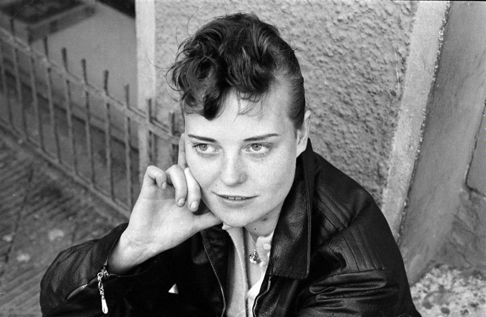
Girl with greased quiff and leather jacket, 1959
AB Helsingborgs-Bild
Kulturmagasinet, Helsingborgs museer. Public Domain

A promising premise

Image factsheetMuch like scents, flavours and music, photographs are powerful triggers of memory. So what better medium to recall a past as recent and as iconic as early postwar Europe…? For about a year, the consortium involved in the project ‘50s in Europe Kaleidoscope’ has been diving into collections of libraries, archives and commercial agencies across Europe, to trace the tracks of the fifties in photography.

‘50s in Europe Kaleidoscope’, a project co-financed by the European Union in the framework of the Connecting Europe Facility Programme, aims at leveraging photographic collections depicting the 1950s in Europeana: Europe’s most trusted and extensive portal to cultural heritage. To increase engagement with Europeana, Kaleidoscope focuses on crowdsourcing and co-curation, inviting European citizens to share personal stories and explore common history.

Compound eye

In the process of exploring and analyzing relevant photo collections for the project, the expected imagery of the era as a time of intrinsic happiness surfaced quite quickly. The rosy outlook on the fifties as a modern-age, bright-coloured paradise, in which horrors from the past seemed to be gone forever, is frozen in our collective memory and fed by nostalgia of the baby boomers. Yet in recent years, a more holistic view has taken root: a layered, nuanced narrative that we soon started to identify in the picture collections at hand.

Statue of Stalin

Statue of Stalin taken down in Budapest, October 1956
National Széchényi Library. CC BY-NC-SA

With project partners from both sides of the Cold War divide, our perspective quickly turned ‘bifocal’. The fifties were indeed the breeding ground for Europe as we know it today, but at the time political regimes, economic circumstances, societal developments, levels of prosperity and consumer trends were very different in the east and west, north and south.  From a political point of view, Europe was a shattered landscape, trying to cope both with internal tensions (dictatorial regimes in Spain and Portugal, Civil War in Greece, revolution in Hungary, …) and the all-dominating dynamics between east (/USSR/communism) and west(/US/capitalism). Colonial empires were dissolving, only reinforcing the vast waves of migration that drove hundreds or thousands of citizens out of – and others into – the continent. Peace brought prosperity – after the first frugal years following WWII – but not in equal measure throughout Europe.

[Automòbil triauto]

The Messerschmitt Kabinenroller in the streets of Girona, July 1954
Martí Massafont Costals
Ajuntament de Girona / CRDI. CC BY-NC-ND

Showtime: exhibition on the go

WhatsApp Image 2019-08-29 at 12.25.51

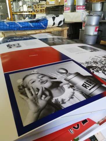
Catalogue in Print, August 2019

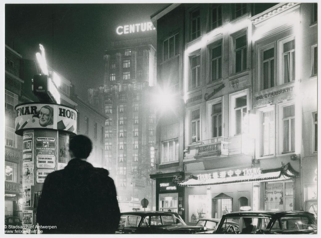
This historical backdrop, as attested to by the collections of our project partners, was the point of departure for a stroll through a decade that is in need of a refreshed historical approach. In the framework of the project, an important showcase to convey this perspective is the physical exhibition created and curated by KU Leuven’s CS Digital: Blue Skies, Red Panic.

With powers as opposite as the capitalist and communist bastions, and phenomena as contrasting as consumerism and crisis, emancipation and dictatorship, traditionalism and counterculture, this exhibition could have easily turned into a simple game of contrasts and opposites. Yet while the pictures we selected are very much black and white, the stories they convey boast an endless range of greys. Through these shades, the reflection of the 1950s gains nuance, color and depth.

On 6 September, in the splendid palazzo Lanfranchi (Museo della grafica) situated alongside the ‘lungarni’ by the river Arno, Blue Skies, Red Panic was baptized. The setup of 26 vintage images, digitized and printed on large-size panels, deployed a rich narrative in 11 chapters boasting duos and trios of images to shed light on huge trends, interesting undercurrents, big history and personal stories. After its first instance in Pisa, the exhibition recently traveled to Girona where it will re-open at the Centre Cultural la Mercè on November 12th. In January we’ll be showing Blue Skies at the KU Leuven Campus Carolus premises in the heart of historical Antwerp, after which it will go on to visit Kulturforum Berlin (February 2020).

IMG-20190906-WA0000

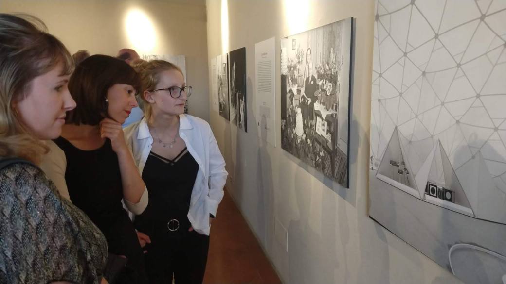
Blue Skies, Red Panic in Pisa, vernissage of September 6th

In the mean time, a completely reworked and extended version of the exhibition has been tailor made for Europeana.eu. Launched only last week, Blue Skies will be open to a large online community.

Annotation 2019-10-31 121838

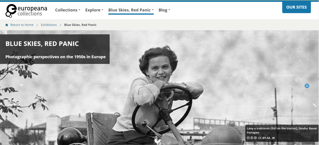
Blue Skies, Red Panic on europeana.eu: similar scenario, remodeled showcase

Finally, an interactive virtual version will be created with the MuPop-app developed by Amsterdam-based company Noterik, allowing visitors to control the narration and listen to the stories simply by using their smartphone. Blue Skies MuPop will be debuting at the Day of Science at KU Leuven (24 November), will go on to be shown at Coventry University (3 December) and is bound to visit more partner premises in months to come.

Musings

2048211_europeana_fashion_NMA_0037192

Campaign image of the Swedish department store Nordiska Kompaniet, 1953
Erik Holmén
Stiftelsen Nordiska museet. CC BY-NC-ND

Having had the pleasure to curate this exhibition from the ground up, I am excited by the way it lends itself to being transformed for different platforms, using different media, offering different modes of interaction and participation. The fact that a beautiful, printed catalogue will serve as the everlasting reminder of a splendid project and the unique creative opportunities it has offered me, is a genuine joy as well. But by far the most rewarding result of this effort are the reactions received so far from people who visited the Pisa-installment, read the catalogue or explored the exhibition via Europeana.

There’s awe for the outstanding quality of the images, smiles of recognition, gasps of surprise, reflection, introspection and discussion. Someone wrote to me: ‘What I liked the most is how each image tells a story, yet the text demonstrates there’s more than what meets the eye’. With the open yet critical attitude that is at the core of CS Digital as a constant driver as well as a goal, such feedback is the best return on (creative) investment I could have wished for.


Feeling curious or creative?

Annotation 2019-10-30 120935We warmly invite you to explore the photographs and stories via photoconsortium.net, where all images and texts can be accessed directly and the exhibition catalogue can be downloaded for free. Via the same website, it’s possible to enter the educational portal and retrieve reusable material. Visit fifties.withculture.eu to create your own fifties collections with images from repositories such as Europeana or your own photographic memories. Finally, we’d be delighted if you could help us help more people retrieve these gems by participating in our annotation campaign on withcrowd.eu.